How to use your app theme in this UI
npm install @tcbs/react-native-mazic-uiYou can easily set up your app's theme using useTcbsColorStore from @tcbs/react-native-mazic-ui. Below is a sample implementation for both light and dark modes:
import { useTcbsColorStore } from '@tcbs/react-native-mazic-ui';const { setTcbsColor } = useTcbsColorStore();React.useEffect(() => { setTcbsColor({ light: { btnColor: '#007AFF', btnBorderColor: '#007AFF', btnIconColor: '#16a62bff', themeColor: '#007AFF', btnTextColor: '#FFFFFF', }, dark: { btnColor: '#222222', btnBorderColor: '#222222', btnIconColor: '#FFFFFF', themeColor: '#222222', btnTextColor: '#FFFFFF', }, });}, []);Access Theme State and Colors
You can access the current theme value (tcbsTheme), the calculated theme mode (currentThemeMode), and the current colors object (themeColors) from useTcbsColorStore:
import React from 'react';import { useTcbsColorStore } from '@tcbs/react-native-mazic-ui';const MyComponent = () => { const { tcbsTheme, currentThemeMode, themeColors } = useTcbsColorStore(); return ( <> <Text>Theme value: {tcbsTheme}</Text> <Text>Calculated mode: {currentThemeMode}</Text> <Text>Theme colors: {JSON.stringify(themeColors, null, 2)}</Text> </> );};Expected Values
- tcbsTheme:
"light","dark", or"system"
User’s selected theme mode. - currentThemeMode:
"light"or"dark"
The effective theme mode (resolved from user or system). - themeColors:
{ btnColor, btnBorderColor, btnIconColor, themeColor, btnTextColor, ... }
An object with the current color values for the active theme.
Set a Single Mazic Color
To quickly set a single Mazic color for your app, use the setMazicColor method as shown below:
import { useTcbsColorStore } from '@tcbs/react-native-mazic-ui';const { setMazicColor } = useTcbsColorStore();React.useEffect(() => { setMazicColor('#174143'); // '#CC561E', '#1E3E62', '#089A9A', etc.}, []);// sets the below keys in theme colors:// btnColor: addAlpha(baseColor,1),// btnBorderColor: baseColor,// btnIconColor: buttonTextColor,// themeColor: baseColor,// btnTextColor: buttonTextColor,// tabBarIconActiveColor: buttonTextColor,// tabBarIconInactiveColor: addAlpha("#000000",0.4),// // modalBgColor: 80% lighter than baseColor// primaryColor: addAlpha(baseColor,1),// secondaryColor: addAlpha(baseColor,0.7),// tertiaryColor: addAlpha(baseColor,0.1),// // Backgrounds (Clean white/near-white neutrals)// screenBgColor: addAlpha(baseColor,0.1), // Pure white// modalBgColor: adjustBrightness(baseColor, 10), // 80% lighter tone// modalTitleColor: adjustBrightness(baseColor, 90),// modalHeaderBgColor: '#F0F0F0', // Light gray// modalCardBgColor: '#FAFAFA', // Off-white for cards/modals// // Text Colors (High contrast black/dark gray)// textPrimary: '#1F1F1F', // Very dark gray// textSecondary: '#6B7280', // Medium gray// // Borders & Dividers (Very subtle grays)// borderColor: '#E5E7EB',// dividerColor: '#F3F4F6',// // Inputs & Cards// inputBgColor: '#FFFFFF',// inputBorderColor: '#D1D5DB',// cardBgColor: '#FFFFFF',// cardBorderColor: '#E5E7EB',// // Status Colors (Standard, high-contrast semantic colors)// accentColor: secondaryBaseColor,// errorColor: '#DC2626',// successColor: '#16A34A',// warningColor: '#F59E0B',Set Theme Mode (Light, Dark, System)
You can set the theme mode to light, dark, or system using setTcbsTheme:
import { useTcbsColorStore } from '@tcbs/react-native-mazic-ui';const { setTcbsTheme } = useTcbsColorStore();// Set theme mode to 'light', 'dark', or 'system'React.useEffect(() => { setTcbsTheme('light'); // or 'dark', or 'system'}, []);Toggle Theme Mode
You can use the toggleTcbsTheme function to quickly switch between theme modes. Here is an example using TcbsButton:
import React from 'react'; import { TcbsButton, useTcbsColorStore } from '@tcbs/react-native-mazic-ui'; const MyComponent = () => { const { tcbsTheme, toggleTcbsTheme } = useTcbsColorStore(); return ( <TcbsButton title={tcbsTheme} variant="primary" iconName="heart" iconPosition="left" onPress={() => toggleTcbsTheme()} /> ); };Ready-made Theme Modal
You can use the ready-made ThemeModal component provided by @tcbs/react-native-mazic-ui for a user-friendly theme selection dialog. Here is how to use it:
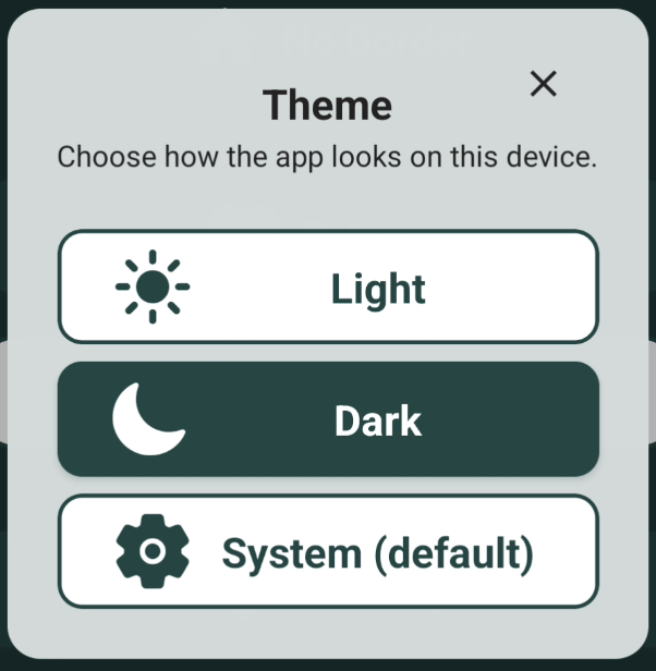
import React from 'react';import { ThemeModal, TcbsButton } from '@tcbs/react-native-mazic-ui';const MyComponent = () => { const [themeModalVisible, setThemeModalVisible] = React.useState(false); return ( <> <TcbsButton title="No Border" variant="no_border" onPress={() => setThemeModalVisible(true)} iconName="home" iconPosition="left" /> <ThemeModal visible={themeModalVisible} onClose={() => setThemeModalVisible(false)} /> </> );};- Supports light and dark themes
- Customizable button, icon, and text colors
- Easy integration with
useTcbsColorStore