← Back to UI Home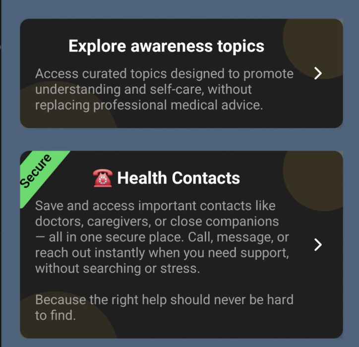
TcbsCard — Informational Card Component
`TcbsCard` is a compact, accessible card component used for presenting short pieces of information with an optional action. It supports an optional secure strap, two visual variants, and automatic theme-aware styling via useTcbsColorStore.
Examples
Example 1
tcbs-cli
<TcbsCard title={t('screens.dashboard.exploreAwarenessTopics') || 'Awareness Topics'} description={t( 'screens.dashboard.awarenessTopicsDesc', 'Access curated topics designed to promote understanding and self-care, without replacing professional medical advice.' )} onPress={() => navigation.navigate('AwarenessTopics')} accessibilityRole="button" accessible/>Example 2 (Secure)
tcbs-cli
<TcbsCard secureText="Secure" title={t('screens.dashboard.healthContacts', '☎️ Health Contacts')} description={t( 'screens.dashboard.healthContactsDesc', 'Save and access important contacts like doctors, caregivers, or close companions — all in one secure place. Call, message, or reach out instantly when you need support, without searching or stress. Because the right help should never be hard to find.' )} onPress={() => navigation.navigate('SecureContactScreen')} accessibilityRole="button" accessible/>Props
- title: string — Required. The main title text displayed in the card.
- description: string — Optional. A short supporting description or subtitle.
- onPress: function — Optional. If provided the card becomes pressable and shows a trailing chevron.
- secureText: string — Optional. Shows a rotated secure strap when provided.
- secureStrapColor: string — Optional. Overrides the strap color; defaults to theme success color.
- variant: 'default' | 'outlined' — Optional. Controls whether the card shows a border.
- trailingIcon: string — Optional. The Ionicons name for the trailing icon (defaults to 'chevron-forward').
- accessibilityRole / accessible — Optional accessibility props passed to the pressable container.
Implementation Notes
- Uses `useTcbsColorStore` for theme-aware colors (e.g., `cardBgColor`, `textPrimary`).
- When `onPress` is provided the root container is a `Pressable` with Android ripple.
- Secure strap is absolutely positioned and rotated to appear as a diagonal label.
- Decorative color accents are placed top-right and bottom-left with reduced opacity.