← Back to UI Home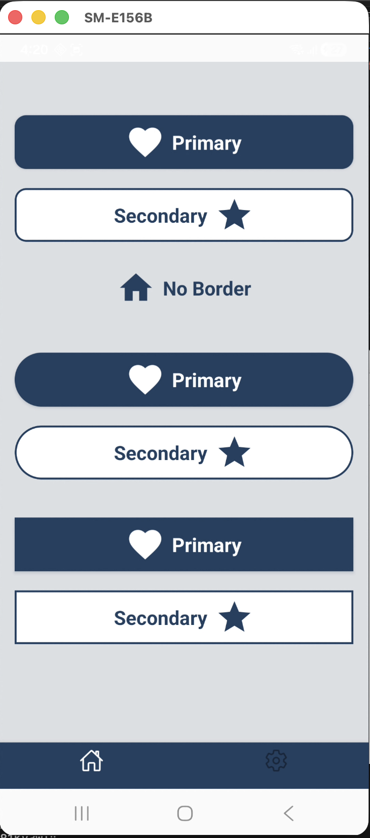
How to use TcbsButton
tcbs-cli
npm install @tcbs/react-native-mazic-uiIntroduction
The TcbsButton component from @tcbs/react-native-mazic-ui is a versatile, customizable button designed for modern React Native applications. It supports multiple sizes, variants, icon groups, accessibility features, and custom styles, making it an essential building block for interactive UIs.
Basic Usage
tcbs-cli
import { TcbsButton } from '@tcbs/react-native-mazic-ui';<TcbsButton title="Submit" onPress={() => console.log('Pressed')}/>Size Variations
tcbs-cli
<TcbsButton title="Large" size="large" onPress={...} /><TcbsButton title="Medium" size="medium" onPress={...} /><TcbsButton title="Small" size="small" onPress={...} />Variant Styles
tcbs-cli
<TcbsButton title="Primary" variant="primary" onPress={...} /><TcbsButton title="Secondary" variant="secondary" onPress={...} /><TcbsButton title="No Border" variant="no_border" onPress={...} />Icon Integration
tcbs-cli
<TcbsButton title="AntDesign" iconName="check" iconGroup="AntDesign" iconPosition="left" onPress={...}/><TcbsButton title="Feather" iconName="arrow-right" iconGroup="Feather" iconPosition="right" onPress={...}/><TcbsButton title="Top Icon" iconName="star" iconGroup="FontAwesome" iconPosition="top" onPress={...}/>Custom Colors and Styles
tcbs-cli
<TcbsButton title="Custom" style={{ backgroundColor: '#222' }} textStyle={{ color: '#FFD700' }} onPress={...}/>Accessibility
tcbs-cli
<TcbsButton title="Accessible" accessibilityLabel="Submit button" accessibilityHint="Submits the form" accessibilityRole="button" onPress={...}/>Disabled State
tcbs-cli
<TcbsButton title="Disabled" disabled onPress={...}/>Summary
TcbsButton is a robust, flexible component for building interactive, accessible, and visually appealing buttons in React Native. By leveraging its variants, sizes, icon support, and customization options, you can create a consistent and professional user experience across your application.
For a full list of props, refer to the exported TcbsButtonProps type in the package documentation.
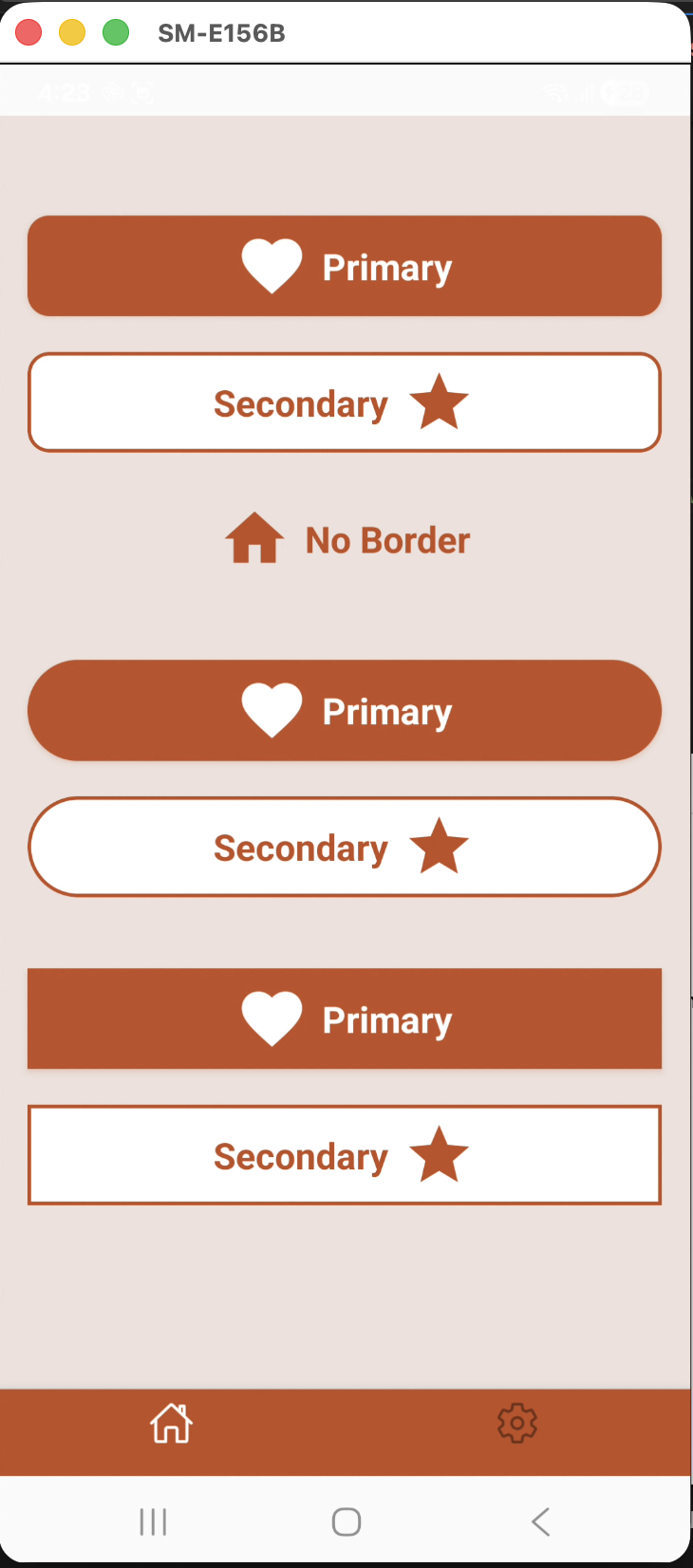
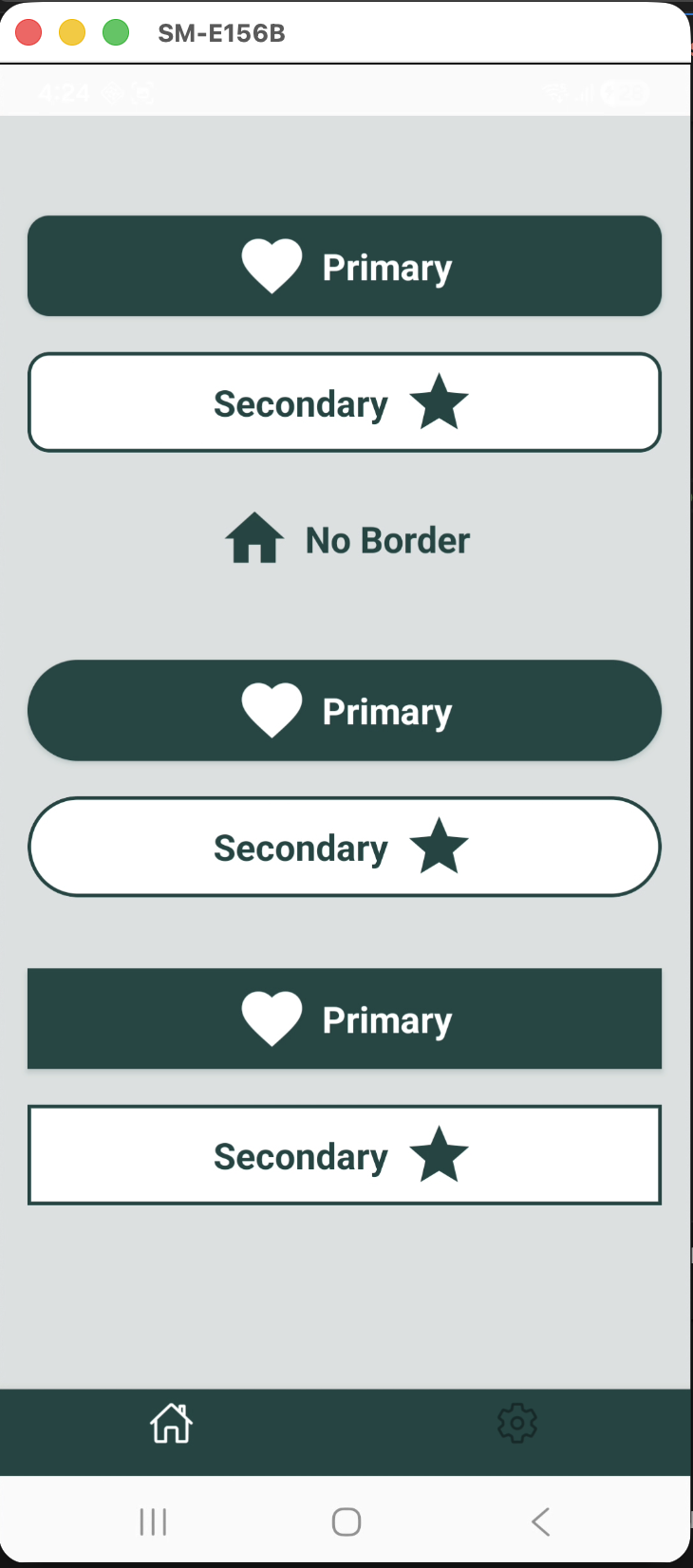
Example Buttons Preview
You can create these buttons using the following code:
<TcbsButton title={"Primary"} variant="primary" iconName="heart" iconPosition="left" onPress={() => toggleTcbsTheme()}/><SizedBox height={metrics.verticalScale(20)} /><TcbsButton title="Secondary" variant="secondary" onPress={() => console.log('TCBS Button Pressed')} iconName="star" iconPosition="right"/><SizedBox height={metrics.verticalScale(20)} /><TcbsButton title="No Border" variant="no_border" onPress={() => setThemeModalVisible(true)} iconName="home" iconPosition="left"/><SizedBox height={metrics.verticalScale(40)} /><TcbsButton title={"Primary"} variant="primary" iconName="heart" iconPosition="left" borderRadius={BORDER_RADIUS.FULL} onPress={() => toggleTcbsTheme()}/><SizedBox height={metrics.verticalScale(20)} /><TcbsButton title="Secondary" variant="secondary" borderRadius={BORDER_RADIUS.FULL} onPress={() => console.log('TCBS Button Pressed')} iconName="star" iconPosition="right"/><SizedBox height={metrics.verticalScale(40)} /><TcbsButton title={"Primary"} variant="primary" iconName="heart" iconPosition="left" borderRadius={BORDER_RADIUS.NONE} onPress={() => toggleTcbsTheme()}/><SizedBox height={metrics.verticalScale(20)} /><TcbsButton title="Secondary" variant="secondary" borderRadius={BORDER_RADIUS.NONE} onPress={() => console.log('TCBS Button Pressed')} iconName="star" iconPosition="right"/>